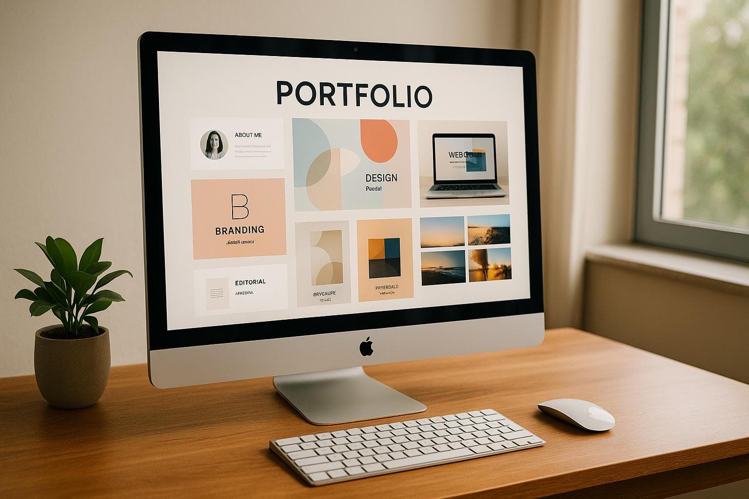
10 Portfolio Design Mistakes to Avoid
Your portfolio is often the first impression you make online. A poorly designed one can hurt your chances of landing jobs or clients. Avoid these 10 common mistakes to create a professional and effective portfolio:
- Poor Font Choices: Stick to 1-2 web-safe fonts and keep sizes consistent for readability.
- Mismatched Colors: Use a primary color, 1-2 complementary colors, and maintain consistency.
- Inconsistent Design Elements: Align buttons, icons, and spacing across your portfolio.
- Unclear Personal Brand: Highlight your role, skills, and value upfront.
- Weak Project Details: Include objectives, your role, tools used, and results for each project.
- Ignoring Work Methods: Showcase how you solve problems through specific examples.
- Slow Page Speed: Compress images, limit plugins, and choose fast hosting.
- Mobile Display Issues: Use responsive designs and ensure easy navigation on small screens.
- Hard-to-Use Menus: Keep menus simple, with clear labels and no more than 5-7 items.
- Image Problems: Use high-quality, optimized images and consistent thumbnails.
Key Takeaway: A clean, well-structured portfolio with clear branding, strong project details, and smooth navigation can help you stand out and attract opportunities. Avoid these mistakes to make a lasting impression.
Don't Make These 10 Mistakes on Your Graphic Design Portfolio
Common Design Mistakes
The visual design of your portfolio leaves a lasting impression. Even small missteps can detract from its professionalism. Let’s break down three frequent design mistakes and how to avoid them for a cleaner, more polished look.
Poor Font Selection
Typography plays a huge role in how your portfolio is perceived. Here are common issues to steer clear of:
- Using more than two typefaces can make your design look cluttered.
- Decorative fonts may look appealing but often hurt readability.
- Inconsistent font sizes can disrupt the flow of your content.
Stick to one font for headlines and another for body text. Opt for web-safe fonts to ensure fast loading and proper display across devices. Keep font sizes consistent: aim for 24-36px for headlines, 18-24px for subheadings, and 16-18px for body text.
Mismatched Colors
Your color palette influences how visitors perceive your portfolio. Follow these tips:
- Pick one primary color to represent your brand.
- Add one or two complementary colors for accents.
- Use these colors consistently throughout your design.
For example, combine a neutral base color like #F5F5F5 with a primary color such as #2C3E50, and use an accent color like #E74C3C for calls-to-action. This approach creates a clear visual hierarchy without overwhelming the viewer.
Mixed Design Elements
Consistency is key to creating a professional and cohesive portfolio. Keep an eye out for these issues:
- Buttons with varying styles.
- Uneven spacing between sections.
- Different treatments for images.
- Icons from multiple design families.
To maintain consistency, create a basic design system that outlines:
- Standard padding and margins (e.g., 16px, 24px, or 32px).
- Uniform button styles and hover effects.
- Consistent image treatments.
- A single icon style throughout.
Content Display Issues
How you present your content can make or break your portfolio. Let’s look at three common mistakes and how to avoid them.
Unclear Personal Brand
Your portfolio should immediately showcase who you are and what you bring to the table. Common pitfalls include:
- Hiding key information below the fold
- Using generic or vague descriptions
- Lacking a clear value proposition
- Presenting an inconsistent personal narrative
"Everything is designed to highlight your value and drive action." - Camille Vingere, Fullstack Developer
To clearly establish your professional identity, try the following:
- Start with a specific job title
- Add a short, impactful professional summary
- Emphasize your top skills
- Keep your messaging consistent across the portfolio
Weak Project Details
Each project in your portfolio should tell a compelling story about your skills and contributions. Avoid being vague by including:
- The project's objectives and challenges
- Your role and responsibilities
- Tools and technologies used
- Tangible outcomes (e.g., metrics, results)
- Relevant visuals to support your descriptions
"It made the whole process super quick and smooth, and I didn't have to worry about design or layout, everything just looked good out of the box." - Fahari Hamada Sidi, Digital Architect
Strong project details also give potential employers or clients a glimpse into how you approach and solve problems.
Overlooking Work Methods
Failing to highlight your work methods can leave your portfolio feeling incomplete. For example, Jenna, a Fullstack Developer, showcases her process through projects like:
- A JavaScript-based To-Do List
- A Java Dungeon Adventure game
- A responsive website for Bordeaux built with HTML5 and CSS3
These projects demonstrate her technical expertise and problem-solving approach.
"It gives you a clean, personal space to show who you are and what you do, without needing to build something from scratch or mess with templates." - Jenna Ramiaramanantsoa, Fullstack Developer
Technical Problems
Technical issues can undermine the effectiveness of your portfolio. Below are three common problems and straightforward ways to resolve them.
Slow Page Speed
A slow-loading portfolio can leave a poor impression. Key causes include:
- Oversized, unoptimized images
- Too many plugins
- Low-quality hosting services
- Files that haven't been compressed
To improve loading speed:
- Compress images before uploading to reduce file size
- Limit plugins to only the essential ones
- Opt for a hosting provider known for speed and reliability
Mobile Display Issues
A portfolio that doesn’t display well on mobile devices can alienate potential clients. Key issues to address:
- Avoid design elements that aren’t responsive
- Use fonts that are easy to read on smaller screens
- Ensure buttons and links aren’t too close together
- Scale images properly for mobile
- Eliminate horizontal scrolling
Using mobile-friendly templates, like those offered by Portf0lio, ensures your portfolio automatically adapts to different screen sizes while maintaining functionality and style.
Hard-to-Use Menu
Poor navigation can frustrate visitors and prevent them from exploring your work. Common issues include:
- Overly complicated, multi-level menus
- Vague or unclear menu labels
- Hidden or hard-to-find items
- Inconsistent menu placement
- Too many options
To create a user-friendly menu:
| Menu Best Practices | Why It Matters |
|---|---|
| Limit main menu items to 5–7 | Keeps navigation simple and avoids overwhelming users |
| Use clear, descriptive labels | Helps visitors find what they need quickly |
| Keep menu placement consistent | Builds familiarity and ease of use |
| Add a contact button | Encourages quick action from potential clients |
sbb-itb-89ca1f2
Image Problems
Once you've fine-tuned the technical aspects, it's time to focus on your images. Avoid these common mistakes, as they can undermine the overall quality of your portfolio.
Poor Image Quality
Your visuals play a huge role in how professional your portfolio looks. Issues like pixelation, blurry resizing, poor lighting, or compression artifacts can make your work appear less polished. To keep things professional, ensure your images are optimized for the web with consistent quality and proper dimensions.
Bad Thumbnails
Thumbnails are the first thing visitors see - they're like the cover of a book for your projects. Poorly chosen thumbnails can stop people from clicking through to explore. Here's how to make them work for you:
- Pick sections of your work that clearly represent the project.
- Keep the size and aspect ratio consistent across all thumbnails.
- Use sharp, well-cropped images that are visually appealing.
- Avoid adding text that becomes unreadable when the image is scaled down.
Good thumbnails not only entice clicks but also tie in smoothly with your portfolio's overall design.
Large File Sizes
Overly large image files can slow down your portfolio, especially if raw files are uploaded, resolutions are too high, or the wrong file formats are used. Here's how to fix that:
- Compress images to reduce size without losing necessary quality.
- Select the right file format for the job - JPG for photos and PNG for graphics often work best.
- Adjust image resolution based on where and how the image will appear in your portfolio.
Layout and Action Buttons
The final touches - your layout and action buttons - can either elevate or undermine your portfolio. These design elements work hand-in-hand with earlier improvements to create a polished, functional presentation.
Uneven Layout
An inconsistent layout can make navigation frustrating. Misaligned margins, content blocks, or images can detract from your portfolio's professionalism. To maintain a clean, organized look, focus on:
- Consistent margins between elements
- Aligned content blocks using a clear grid
- Uniform image sizes
- Even spacing throughout
A well-structured layout ensures your work takes center stage.
Crowded Pages
Overloading pages with content can overwhelm visitors. Giving your portfolio breathing room allows each element to shine. Prioritize:
- Proper spacing between content blocks
- Whitespace to separate major sections
- A limited number of items per row
- Balanced content distribution
This approach helps viewers focus on what matters most - your work.
Missing Contact Buttons
Your portfolio’s primary purpose is to encourage connections. A visible, easy-to-find contact button on every page is non-negotiable. As Camille Vingere, Fullstack Developer, puts it:
"What really makes the difference is how conversion-focused it is. Everything is designed to highlight your value and drive action. If you want something that not only looks good but also helps you get more leads or opportunities, this is the tool to use."
Make it simple for potential clients or employers to reach out. A clear call-to-action can turn interest into opportunity.
Conclusion: Creating an Effective Portfolio
Building a professional portfolio becomes much simpler when you avoid common design missteps. Stick to straightforward design principles - consistent spacing, readable typography, and well-placed calls-to-action - to turn visitors into opportunities. Balancing aesthetics with usability is key to making your portfolio stand out.
Industry professionals emphasize the importance of thoughtful design:
"With Portf0l.io, I finally have a space where I can quickly share my projects and see real engagement. It's super satisfying to ship something, add it to my portfolio in seconds, and then check the clicks rolling in."
"Now I have a portfolio that I'm proud to share, and it really helps me show what I've been working on in a clear and professional way. I definitely recommend it to anyone who wants to put their work out there without overcomplicating things."
So far, more than 438 creators have successfully launched their portfolios using these tools. With Portf0l.io’s SEO-friendly templates and real-time analytics, you can avoid design errors and attract the opportunities you’re looking for.
FAQs
What’s the best way to showcase my personal brand in a portfolio?
To effectively highlight your personal brand, focus on creating a portfolio that reflects your unique style and professional strengths. Use a clean, professional design and include key elements like your projects, work experience, education, and social links. Ensure the content and visuals align with your branding, making it easy for visitors to understand your story and expertise.
Additionally, choose a platform that simplifies the process, allowing you to quickly build a polished, professional site. Look for features like customizable templates, SEO optimization, and seamless sharing options to help you stand out and grow your online presence.
How can I improve my portfolio's loading speed and make it mobile-friendly?
To enhance your portfolio's loading speed and mobile responsiveness, focus on using lightweight, clean templates and ensure all images are optimized for web use. Avoid overly complex design elements that can slow down performance.
Portf0lio simplifies this process by offering fast-loading, mobile-optimized templates designed to look great on any device. Each portfolio is built with search engine optimization in mind, which helps improve visibility while maintaining seamless functionality across desktops, tablets, and smartphones.
What’s the best way to showcase my projects to impress potential employers or clients?
To make a strong impression, organize your projects in a clean and professional portfolio that highlights your unique style and expertise. Focus on presenting your work with clear visuals, concise descriptions, and relevant details like your role, tools used, and the impact of each project.
Include sections for your experience, education, and skills, and ensure the layout is easy to navigate. A well-structured portfolio not only demonstrates your abilities but also makes it simple for employers or clients to understand your value at a glance.