10 Tips for Mobile-Friendly Portfolio Design
Most of your audience is on mobile. With 61% of web traffic coming from mobile devices in 2024, your portfolio needs to be mobile-friendly to keep visitors engaged and improve your search rankings. Poor design - like unreadable text or hard-to-tap buttons - can drive users away. Here’s how to fix it:
- Use a Responsive Layout: Create fluid grids and test on multiple devices.
- Simplify Navigation: Add touch-friendly buttons (44×44 pixels) and a clean mobile menu.
- Prioritize Readability: Use at least 16px font size, proper line height, and high contrast.
- Optimize Images: Compress files, use lazy loading, and switch to WebP or SVG formats.
- Simplify User Actions: Keep forms short, use smart inputs, and guide users step-by-step.
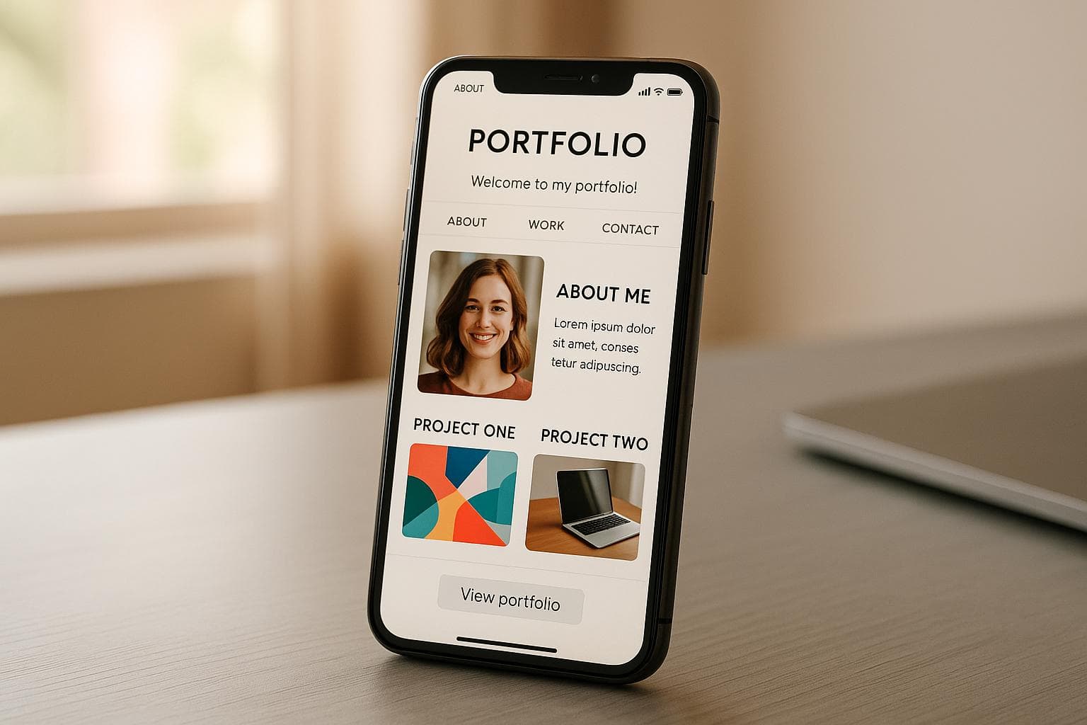
Quick Tip: Use tools like Portf0lio for pre-built, mobile-optimized templates. Testing your portfolio on real devices ensures it works smoothly for all users. A polished mobile experience can make or break first impressions - don’t leave it to chance.
Create a Responsive Portfolio Website with HTML CSS JS AI from scratch
1. Build a Responsive Layout
Creating a responsive layout is key to ensuring your mobile portfolio looks great and functions well across all devices.
Set Up Fluid Grids
Fluid grids rely on relative units like percentages instead of fixed pixels, allowing your content to adjust seamlessly to different screen sizes.
.portfolio-gallery {
  display: grid;
  grid-template-columns: repeat(auto-fill, minmax(300px, 1fr));
  gap: 20px;
}
This CSS example sets up a gallery that shifts from multiple columns on larger screens to a single column on smaller devices, maintaining proper spacing and proportions.
Add Device-Specific Styles
Media queries enable you to fine-tune your portfolio for various screen sizes. Here are some key breakpoints to consider:
| Screen Size | Width Range | Layout Focus |
|---|---|---|
| Mobile | 320px–480px | Single column, larger text |
| Tablet | 481px–768px | Two columns, balanced spacing |
| Desktop | 769px–1024px | Multi-column, full functionality |
| Large Desktop | 1025px+ | Enhanced visuals and presentation |
Check on Multiple Devices
Once you've tailored your styles, it's important to test your portfolio on real devices to ensure everything works as intended. Here's what to look for:
- Touch Targets: Buttons and links should be at least 44×44 pixels for iOS and 48×48 pixels for Android.
- Readability and Navigation: Verify that text is easy to read and navigation is intuitive on all screen sizes.
- Image Handling: Ensure images load quickly and scale appropriately.
- Interactive Element Placement: Position key interactive features in the lower two-thirds of the screen for easier thumb access.
2. Make Navigation Touch-Friendly
Creating navigation that's easy to use on touchscreens is essential for keeping mobile visitors engaged with your portfolio. A smooth and intuitive touch experience ensures visitors can explore your work without frustration.
Size Buttons for Easy Tapping
Make sure all interactive elements, like buttons and links, are at least 44×44 pixels. This size minimizes tapping errors, accommodates users with different motor skills, and gives your portfolio a polished look. Pair this with a clean, streamlined menu to make navigation even clearer.
Add a Mobile Menu
The hamburger menu has become the go-to design for mobile navigation because it keeps the screen uncluttered while offering easy access to key sections. When setting up your mobile menu:
- Keep it simple with 4–8 essential items to avoid overwhelming users.
- Use your logo as a link to the homepage, placed at the top-left, instead of a separate "Home" button.
- Organize items with vertical dropdowns for better readability and structure.
A well-organized menu ensures visitors can focus on your portfolio content without distractions.
Show Tap Feedback
Providing visual feedback for taps reassures users and makes the experience more intuitive. Here are some ways to incorporate feedback:
- Color Changes: Buttons or links should shift color when tapped.
- Active Highlights: Clearly indicate the current section with visual markers.
- Smooth Animations: Subtle transitions can confirm successful interactions.
- Loading Indicators: Show progress for actions that take time to process.
These small touches reduce confusion, prevent unnecessary repeat taps, and create a more user-friendly browsing experience. Attention to these details can make your portfolio stand out.
3. Make Text Easy to Read
Clear, readable text is just as important as touch-friendly navigation for creating a smooth mobile experience.
Choose Font Sizes That Work
Set your body text to at least 16px for easy reading. When picking fonts:
- Stick with clean, sans-serif options like Roboto, Open Sans, or Lato for better clarity.
- Make headings stand out with sizes around 20-24px to keep the visual hierarchy intact.
- Steer clear of decorative or script fonts - they can be hard to read on smaller screens.
Use the Right Line Height
A line height of about 1.5 times your font size ensures enough spacing between lines. This helps create comfortable whitespace and makes reading less of a strain.
Ensure Strong Text Contrast
Good contrast between text and background is key for readability. Here are a few guidelines:
| Text Type | Minimum Contrast Ratio | Example |
|---|---|---|
| Body Text | 4.5:1 | Black text (#000000) on a white background (#FFFFFF) |
| Large Text | 3:1 | Dark gray (#595959) on a light background (#F5F5F5) |
| Interactive Elements | 4.5:1 | Navy blue (#003366) on a cream background (#FFFAF0) |
Pair these text adjustments with a clear content structure. Use short paragraphs, add strategic spacing, and stick to consistent formatting. This not only improves readability but also aligns well with Google's mobile-first indexing.
Up next, we'll explore how to balance visual elements to complement your text.
sbb-itb-89ca1f2
4. Balance Image Speed and Quality
Images play a key role in captivating visitors, but if they load too slowly, they can drive people away. The challenge is to optimize images while keeping them crisp and clear.
Reduce Image File Sizes
Compressing images is a simple yet powerful way to speed up your site. For logos and UI elements, lossless compression tools like ImageOptim or TinyPNG work well. For photos and artwork, lossy compression tools such as Squoosh or TinyPNG are great options. Additionally, converting images to modern formats like WebP can shrink file sizes even further.
Here’s why this matters: Studies reveal that cutting image file sizes can slash page load times by up to 50%, which directly impacts user retention. But don’t stop there - always preview compressed images on different devices to ensure they still look polished. After optimizing, consider loading images only as they’re needed for even better performance.
Load Images On-Demand
Lazy loading is a smart approach to prioritize content that users see first. By adding the loading="lazy" attribute to your image tags, you can delay loading off-screen visuals until they’re actually needed:
<img src="portfolio-piece.jpg" loading="lazy" alt="Project description">
This technique can dramatically speed up initial load times. For instance, a design portfolio reduced its load time from 6 seconds to under 2 seconds, which led to a 30% increase in user retention.
Use Vector Graphics
When it comes to logos, icons, and simple illustrations, vector graphics (SVGs) are your best friend. They offer several advantages:
- Stay sharp no matter the size
- Produce smaller file sizes for basic designs
- Easily customizable with CSS for colors and dimensions
However, for detailed images like photographs or intricate artwork, stick with optimized JPEGs or modern formats like WebP. The trick is to match the format to the type of image, ensuring both speed and visual appeal.
5. Make User Actions Simple
Mobile users expect quick and seamless interactions. With 93% of internet users browsing on mobile devices daily, ensuring smooth user experiences is key to keeping them engaged. This aligns with the importance of responsive, touch-friendly design.
Trim Down Required Fields
Long forms can frustrate users and hurt mobile conversions. Stick to the basics for contact forms by only asking for:
- Name
- Brief Message
By keeping forms short and straightforward, you make it easier for users to complete them.
Use Smart Input Features
Speed things up for users by incorporating helpful tools like:
- Auto-fill options
- Input masks for phone numbers (e.g., (555) 123-4567)
- Context-specific keyboards (e.g., numeric keyboards for phone numbers)
- Predictive text suggestions
These features not only save time but also minimize errors, making the process smoother for everyone.
Present Information in Steps
Breaking down content into manageable steps makes it easier for users to follow along. Here's how:
- Start with the essentials: Show the most important details first, like project thumbnails or a brief bio.
- Use progressive disclosure: Allow users to reveal more information through expandable sections or "Read More" buttons.
- Create logical flows: Guide users naturally through multi-step processes, ensuring each step feels intuitive.
One great example of this approach is Portf0lio. Their guided process helps users quickly add projects, experiences, and social links without feeling overwhelmed. By focusing on one step at a time, they ensure all necessary information is captured without confusing the user.
6. Use Portfolio Building Tools
Creating a mobile-friendly portfolio no longer requires mastering complex code or spending hours on development. According to recent data, portfolios built with mobile-optimized tools are 2.5 times more likely to keep visitors engaged compared to non-optimized sites. This means better viewer retention and quicker project turnarounds.
Portf0lio: Build Your Site in Minutes
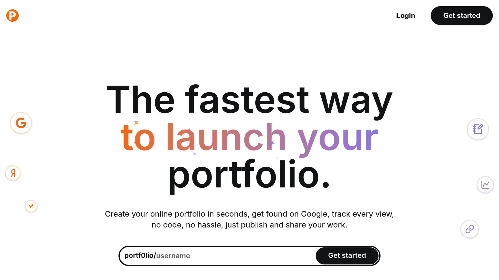
If you're looking for an easy way to create a sleek, mobile-ready portfolio, Portf0lio is a standout option. The platform is designed to simplify the process while delivering professional results.
Built-in Mobile Optimization
Here’s how Portf0lio ensures your portfolio looks and performs well on any device:
- Fully responsive templates that adapt to any screen size
- Touch-friendly navigation with tap targets sized for easy use
- Optimized image loading for faster performance
- Clean, readable fonts that work well on smaller screens
Save Time and Money
Building a custom portfolio from scratch can take 40–80 hours and cost anywhere from $2,000 to $10,000. But with Portf0lio, you can launch a polished, professional site in under a minute.
Here’s what users have to say:
"I gave Portf0lio a try and I'm genuinely impressed with the result! It made creating and sharing my developer portfolio incredibly easy and enjoyable".
SEO and Performance Built In
The platform takes care of the technical details, so you don’t have to. Features include:
- Mobile-first indexing for better search engine visibility
- A structure optimized for search engines
- Tools to monitor performance and engagement
- Real-time analytics to track how users interact with your portfolio
By automating these technical aspects, Portf0lio lets you focus on showcasing your work instead of troubleshooting.
"Building a portfolio used to be such a time-consuming task… but not anymore! With Portf0lio, I was able to launch a clean, professional portfolio in minutes, no headaches, no endless tweaking".
"With Portf0lio, I finally have a space where I can quickly share my projects and see real engagement. It's satisfying to ship something, add it to my portfolio in seconds, and then check the clicks rolling in".
Conclusion: Mobile Portfolio Checklist
Creating a mobile-friendly portfolio isn't just a nice-to-have - it's a must. With 54% of global web traffic coming from mobile devices, ensuring your portfolio is optimized for smaller screens is key to keeping users engaged and your visibility intact.
Here’s a quick checklist to guide your mobile portfolio optimization:
| Category | Key Requirements | Why It Matters |
|---|---|---|
| Responsive Design | - Fluid grids - Flexible images - Adaptive styles |
Keeps your portfolio looking sharp on any screen size or device. |
| Navigation | - Touch targets ≥44px - Thumb-friendly buttons - Visual feedback for taps |
Avoids user frustration and makes navigation effortless. |
| Text Readability | - Minimum 16px font size - Line height of 1.4–1.6 - High contrast text |
Ensures your content is easy to read, even on smaller screens. |
| Image Optimization | - Compressed images - Lazy loading - Vector icons |
Speeds up load times without sacrificing image quality. |
| User Experience | - Minimized form fields - Auto-complete options - Clear call-to-action buttons |
Simplifies interactions, making it easier for users to engage with your content. |
Testing and Verification
After implementing these optimizations, test your portfolio rigorously on actual mobile devices. Focus on:
- Load times across various network speeds.
- Touch interactions to ensure buttons and links respond smoothly.
- Form functionality with mobile keyboards, ensuring ease of use.
FAQs
What are the best practices for making my portfolio look great on all mobile devices?
To make sure your portfolio shines on all mobile devices, prioritize a responsive design. This means using layouts that adjust to various screen sizes, selecting fonts that are easy to read, and including touch-friendly navigation - think larger buttons and clearly visible links.
Tools like Portf0lio can make this process a breeze. Their mobile-optimized templates help your site look polished and work smoothly across devices. With just a little effort, you can create a portfolio that's visually impressive and easy to navigate for mobile users.
What are the main advantages of using Portf0lio to create a mobile-friendly portfolio?
Portf0lio simplifies the process of creating a professional, mobile-ready portfolio. No coding skills? No problem. In less than a minute, you can have a fully-hosted site up and running.
Pick from six stylish, customizable templates crafted to perform seamlessly on mobile devices. Each portfolio is optimized for search engines, helping your work stand out on Google. Plus, sharing your portfolio is a breeze with a single, all-in-one link.
It's an ideal solution for presenting your work in a sleek, easy-to-navigate format that looks fantastic on any screen.
Why is optimizing images important for mobile-friendly portfolios, and how can it be done effectively?
Optimizing images is a key step in creating a mobile-friendly portfolio. Why? Because smaller, optimized images mean faster load times, smoother performance, and a better experience for users navigating on smaller screens. On the flip side, large, unoptimized images can bog down your site, especially for mobile users dealing with limited bandwidth.
Here are some practical tips to get it right:
- Compress your images: Use tools or software that reduce file size without sacrificing quality.
- Choose the right file format: JPEG works well for photos, while PNG is ideal for graphics that need transparency.
- Resize images appropriately: Scale them to match the display dimensions on your site to avoid oversized files.
- Implement lazy loading: This ensures images load only when they’re about to appear on the screen, saving resources.
By applying these techniques, your portfolio will not only look polished but also load efficiently, keeping mobile users happy and engaged.