
Best Practices for Responsive Portfolio Layouts
Crafting a responsive portfolio is essential to ensure your work looks great on any device. Here's how to make it happen:
- Start with Mobile Design: Design for smaller screens first, then scale up for larger devices.
- Use Flexible Layouts: Implement CSS Grid or Flexbox for layouts that adjust seamlessly across devices.
- Optimize Media: Resize images, use responsive typography, and ensure videos load quickly.
- Simplify Navigation: Use a hamburger menu for mobile and keep touch targets easy to interact with.
- Focus on Speed: Optimize load times with lazy loading, caching, and minimized JavaScript.
- Test on Devices: Combine browser tools and real-device testing for a flawless experience.
- Ensure Accessibility: Add alt text, use proper contrast ratios, and support keyboard navigation.
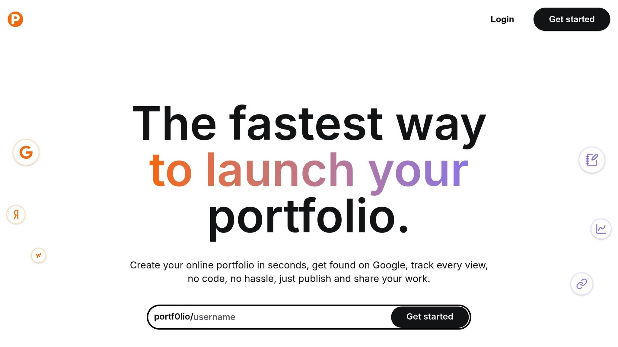
Quick Tip: Tools like Portf0l.io make creating responsive portfolios simple, with ready-made templates and built-in optimizations.
Key Elements of Responsive Portfolios
Grid Systems and Layout
A well-structured grid is crucial for responsive portfolio design. By using tools like CSS Grid and Flexbox, layouts can adjust seamlessly to different screen sizes while maintaining consistency.
Here’s how layouts typically adapt:
- Mobile: Single column layout (100% width with 16–24px gutters)
- Tablets: Two columns (approximately 47–48% width per column)
- Desktop: Three or four columns (around 30–32% width per column with 24–32px gutters)
Once the layout is in place, the next focus should be on navigation.
Mobile Menu Design
Navigation plays a key role in responsive design, especially on smaller screens. A common solution is the hamburger menu, which can expand into a full-width navigation bar on larger devices while saving space.
Here are some tips for effective mobile-friendly navigation:
- Keep menu items limited to 4–5 sections for simplicity.
- Ensure a minimum touch area of 44×44px for easy interaction.
- Position the menu icon in the top right corner for familiarity.
- Use an animation duration of 0.3 seconds for smooth transitions.
When the menu expands, options should appear vertically with each item having a minimum height of 48px for easy selection. After navigation is set, it’s time to optimize media elements.
Images, Video, and Text Sizing
To ensure clarity across devices, media elements like images, videos, and text should be optimized using relative units.
Here’s how to handle each:
-
Images: Use CSS to make images responsive:
img { max-width: 100%; height: auto; } -
Text:
- Body text: 16px for mobile, 18px for desktop
- Headings: Between 24px and 48px
- Line heights: 1.5 for body text, 1.2 for headings
-
Videos:
- Embed with a 16:9 aspect ratio
- Include native controls, lazy loading, and fallback images
- Test on slower connections to ensure load times stay under 3 seconds
Properly scaling these elements ensures your portfolio looks sharp and performs well across all devices.
Mobile and Desktop Design Standards
Starting with Mobile Design
Since most users browse on mobile devices, designing for mobile first ensures your portfolio works well on smaller screens before scaling up to larger ones. Here's what to prioritize:
- Single-column layouts to stack content vertically
- Touch-friendly elements with a minimum size of 44×44px for easy tapping
- Streamlined navigation to avoid clutter
- Highlight key content by showcasing your best work upfront
This approach helps create a clear and organized content hierarchy.
Content Order and Display
Organize your portfolio based on screen size for the best user experience:
| Screen Size | Main Content | Secondary Content | Navigation |
|---|---|---|---|
| Mobile | Project previews | About section | Hamburger menu |
| Tablet | Project grid | Contact info | Expandable navigation |
| Desktop | Full portfolio | Detailed bio | Full navigation |
"Everything is simple and clear from the start... The platform takes care of the structure so you can focus on sharing your content and your value." - Kevin Dumont, LinkedIn Coach
Once the structure is in place, the next step is to ensure your site loads quickly.
Speed and Loading Times
Slow-loading pages can hurt both user engagement and search rankings. Here are some ways to improve loading times:
- Optimize image sizes to balance quality and speed
- Use lazy loading for content below the fold
- Minimize JavaScript execution to reduce delays
- Cache static assets so repeat visitors experience faster load times
"What really makes the difference is how conversion-focused it is. Everything is designed to highlight your value and drive action." - Camille Vingere, Fullstack Developer
Quality Control for Responsive Sites
Device and Browser Testing
Combine automated tools like Chrome DevTools Device Mode with real-device testing to catch issues that simulations might overlook. This approach ensures your design works seamlessly across different devices and browsers.
Making Sites Work for Everyone
Creating a site that's usable for all visitors goes beyond just performance. Accessibility should be a priority. Here's how to make your site more inclusive:
Color and Contrast
- Ensure text contrast meets a minimum ratio of 4.5:1 for readability.
- Use patterns or icons to support color-based cues.
- Test designs in grayscale to confirm that color-dependent information remains understandable.
Navigation and Structure
- Support keyboard navigation for those who rely on it.
- Add descriptive alt text for images to improve screen reader compatibility.
- Structure content with a clear heading hierarchy (H1 through H6) to enhance readability and accessibility.
Using Data to Improve Design
Analytics can highlight how well your portfolio performs and where it needs work. Track metrics like page load time, TTFB (Time to First Byte), FCP (First Contentful Paint), and LCP (Largest Contentful Paint). Tools such as Google Analytics can provide insights into page popularity, session durations, and bounce rates across different devices. For example, if mobile users engage less than desktop users, it may be time to refine your mobile layout. Regularly reviewing these metrics helps guide meaningful design improvements.
sbb-itb-89ca1f2
How to Design and Code a Responsive Portfolio Website ...
Building with Portf0l.io
Portf0l.io combines automated tools with built-in design features to make portfolio creation simple and efficient. By handling the technical aspects of responsive design, the platform allows users to focus entirely on their content.
Quick Portfolio Creation
Portf0l.io simplifies the process of creating a responsive portfolio with an easy-to-use dashboard. You can have a fully functional, responsive portfolio ready in less than a minute - no coding required.
| Feature | Responsive Benefit |
|---|---|
| Instant Setup | Automatically adjusts layouts for all devices |
| Project Showcase | Creates optimized grid layouts for any screen size |
| Content Management | Scales content seamlessly across different devices |
| Social Integration | Includes mobile-friendly links to social media |
Built-in Design Tools
The platform offers six templates designed with modern responsive principles. These templates include:
- Fluid Grid Systems: Automatically adapts layouts to different screen sizes.
- Smart Image Scaling: Ensures images look great on all devices.
- Responsive Typography: Keeps text clear and readable, no matter the screen.
"No need to fight with templates or figure out how to make things look good, it just works, and the result is always clean and professional." - Mathieu Trunet, Fullstack Developer
These tools also enhance search visibility and overall platform performance.
Search and Performance Features
Portf0l.io is built to perform well in search engines and deliver fast loading times on both mobile and desktop. Key features include:
- SEO-Ready Structure: Optimized for higher rankings in Google search results.
- Performance Optimization: Ensures quick load times across all devices.
- Analytics Integration: Tracks performance metrics for your portfolio.
"One of the things I love about Portf0l.io is that it gives you a clean personal portfolio and a do-follow backlink, which is amazing for SEO." - Ramzi ₿, SDD Founder
Portf0l.io's approach to responsive design and performance has earned it recognition, including being ranked #2 Product of the Day and #1 Product of the Week on Uneed. This highlights its ability to meet the needs of modern portfolio creators.
Summary
This section pulls together the key points for creating a responsive portfolio that works seamlessly across devices while maintaining a polished, professional appearance. Success lies in combining thoughtful design with precise coding.
Here are the core elements to focus on:
| Element | Impact | Best Practice |
|---|---|---|
| Layout Adaptability | User Experience | Use fluid grid systems that adjust to screen sizes |
| Performance | Site Speed | Optimize images and implement efficient loading strategies |
| Search Visibility | Reach | Ensure a mobile-first, SEO-friendly structure |
AI Engineer Salim Laimeche shares his thoughts:
"With Portf0l.io, I finally have a space where I can quickly share my projects and see real engagement. It's super satisfying to ship something, add it to my portfolio in seconds, and then check the clicks rolling in."
A responsive portfolio thrives on clean design, quick load times, and SEO-friendly features to maximize both engagement and visibility.
"Portf0l.io is honestly the best way I've found to stand out professionally. It gives you a clean, personal space to show who you are and what you do, without needing to build something from scratch or mess with templates." – Jenna Ramiaramanantsoa, Fullstack Developer
The right balance of technical precision and user focus is what makes a responsive portfolio effective - something Portf0l.io delivers effortlessly.
FAQs
How can I make sure my portfolio looks great and works well on all devices?
To ensure your portfolio is both visually appealing and functional across different devices, focus on using responsive design principles. This means your layout should automatically adjust to fit various screen sizes, from smartphones to desktops, without compromising usability or design.
Using a platform like Portf0l.io can simplify this process. It provides clean, responsive templates that adapt seamlessly to any device, ensuring your portfolio is easy to navigate and delivers a professional user experience. By prioritizing responsiveness, you’ll create a portfolio that leaves a great impression, no matter how it’s viewed.
What are the most common mistakes to avoid when creating a responsive portfolio layout?
Designing a responsive portfolio layout can be challenging, but avoiding a few common mistakes can help ensure a polished and seamless experience across all devices:
- Neglecting mobile users: Failing to optimize for smaller screens can alienate a significant portion of your audience. Make sure your layout adapts fluidly to different screen sizes.
- Overloading with content: Too much text, images, or animations can slow down your site and overwhelm visitors. Keep your design clean and focused on showcasing your work.
- Ignoring accessibility: Ensure your portfolio is usable for everyone by using proper contrast, readable fonts, and clear navigation.
By addressing these issues, you can create a professional and user-friendly portfolio that leaves a lasting impression.
Why is starting with a mobile-first design important for creating a responsive portfolio?
Starting with a mobile-first design ensures your portfolio is optimized for smaller screens before scaling up to larger devices. This approach prioritizes essential content and functionality, creating a smoother user experience across smartphones, tablets, and desktops.
By focusing on mobile-first principles, your portfolio will load faster, be easier to navigate, and provide a professional impression no matter how users access it. This strategy is especially important when showcasing your work to a diverse audience using various devices.