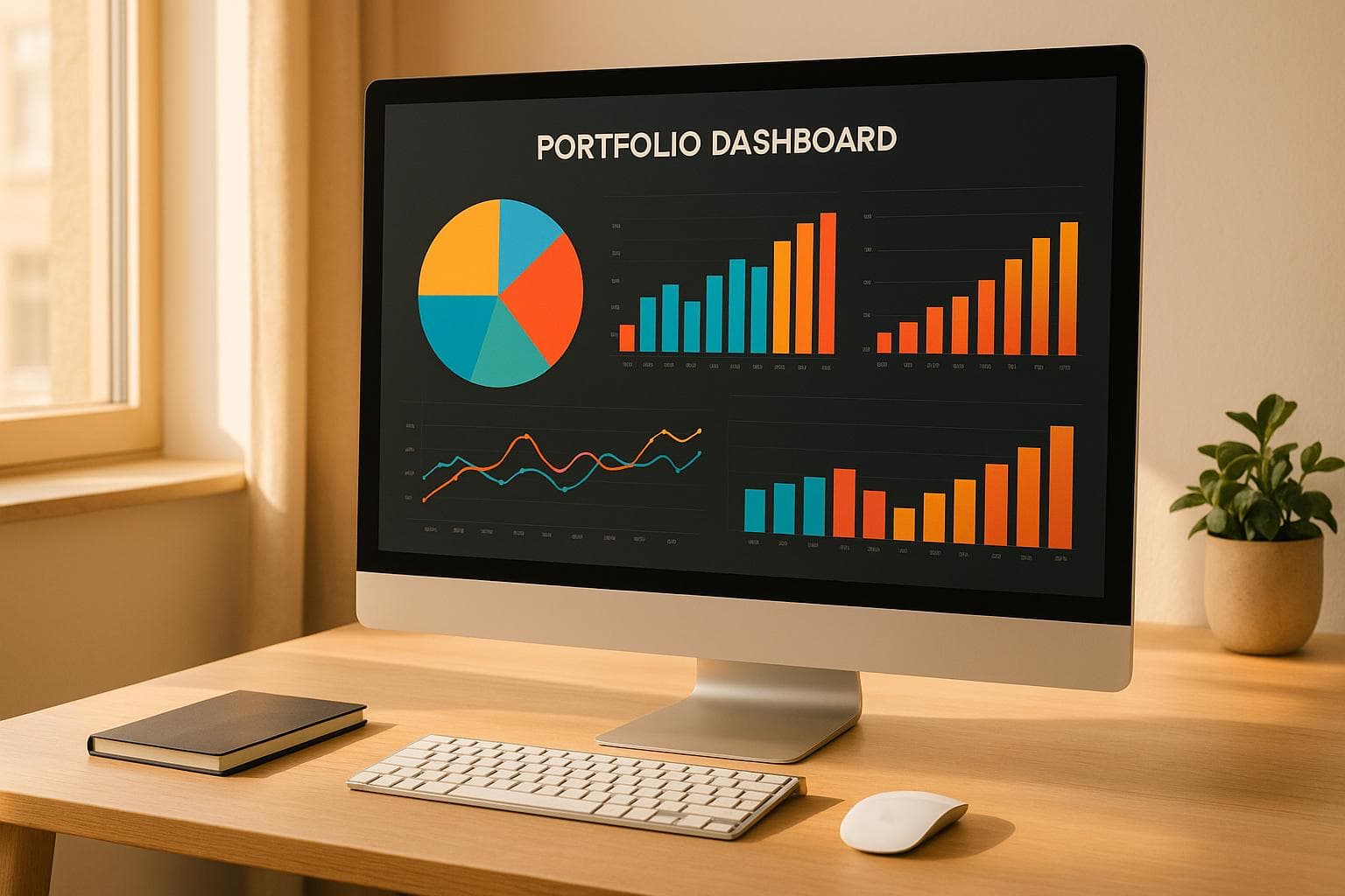
Top 5 Tools for Portfolio Data Visualization
Data visualization can make your portfolio more engaging and easier to understand. Here are the top 5 tools to transform raw data into impactful visuals:
- Tableau ($75/month): Best for creating interactive dashboards with deep customization.
- Microsoft Power BI ($9.99/month): Ideal for seamless integration with Microsoft tools like Excel.
- Qlik Sense: Simplifies data exploration with intuitive storytelling features.
- Sisense: Great for embedding analytics and managing complex datasets.
- Domo: Cloud-based and user-friendly for real-time dashboards.
Quick Comparison
| Tool | Price | Best For | Key Features |
|---|---|---|---|
| Tableau | $75/month | Interactive dashboards | Customization, enterprise-level tools |
| Power BI | $9.99/month | Microsoft integration | AI insights, Excel compatibility |
| Qlik Sense | Contact for pricing | Simplified data discovery | Code-free modeling, storytelling |
| Sisense | Contact for pricing | Embedded analytics | API support, single-stack system |
| Domo | Contact for pricing | Cloud-based dashboards | Real-time updates, ease of use |
Choose the tool that aligns with your data needs, budget, and technical skills to create visuals that stand out.
Top 5 Data Visualization Tools
What to Look for in Data Visualization Tools
The right features can turn your data into professional, impactful visuals. Here's a breakdown of the key attributes to consider when selecting a tool.
Simple Setup and Operation
A tool that’s easy to set up and use can save time and reduce frustration. Research indicates that better usability also lowers support costs.
Look for features like:
- Drag-and-drop interfaces for quick adjustments
- Templates and presets to jumpstart your designs
- Clear navigation for intuitive use
- Progressive feature discovery, so you can explore advanced options as needed
Design Options and Branding
Your data visualizations should align with your overall brand identity. High-quality tools offer customization options that ensure your visuals not only look polished but also stay consistent with your branding.
| Element | Purpose | How to Apply |
|---|---|---|
| Color Palette | Reinforce brand identity | Match your brand’s color scheme |
| Typography | Improve readability | Stick to consistent fonts |
| Layout | Organize information | Place critical data strategically |
| White Space | Enhance clarity | Keep visuals neat and uncluttered |
Besides aesthetic considerations, make sure the tool is technically compatible with different platforms so your visuals perform well everywhere.
Export and Platform Support
Sharing and embedding your visualizations should be seamless. A good tool will support multiple export formats and ensure your visuals maintain their quality across devices.
Key technical features to prioritize:
- High-resolution exports for crisp visuals
- Responsive design to adapt to various screen sizes
- Support for multiple file formats (e.g., PNG, PDF, SVG)
- Direct embedding options for websites or presentations
Additionally, tools with robust documentation and regular updates are more likely to stay compatible with evolving platforms, ensuring your visualizations remain professional and functional over time.
"Ease of use may be invisible, but its absence sure isn't".
5 Leading Data Visualization Tools
Here’s a look at five tools designed to transform your data into impactful visuals. Each of these platforms aligns with the key features discussed earlier, ensuring your portfolio stands out as both engaging and polished.
1. Tableau: Comprehensive Data Design
Tableau is a powerhouse for creating professional, interactive dashboards. With a starting price of $75 per user per month, it’s packed with enterprise-level features and boasts an impressive average rating of 4.4 out of 5.
Why choose Tableau?
- Build sleek, interactive dashboards.
- Gain a competitive edge in the job market.
- Enjoy extensive customization options.
2. Microsoft Power BI: Seamless Microsoft Integration
Power BI, priced at $9.99 per user per month, is perfect for those already using Microsoft tools. It offers smooth integration with Excel and other Microsoft products.
| Feature | Benefit |
|---|---|
| Microsoft Suite Integration | Effortless data flow from Excel |
| AI-Powered Analytics | Automated insights generation |
| Secure Embed Support | No-code integration for reports |
| Real-time Updates | Live, dynamic data visualization |
3. Qlik Sense: Simplified Data Discovery
Qlik Sense makes exploring data intuitive and accessible. Its associative data model helps reveal hidden connections, allowing users to craft compelling visual narratives without needing advanced coding skills.
Highlights of Qlik Sense:
- Flexible data exploration tools.
- Code-free modeling for ease of use.
- Interactive storytelling capabilities.
- Strong relationship mapping between data points.
4. Sisense: Embedded Analytics Simplified
Sisense uses a single-stack architecture to make presenting complex data straightforward. It also offers powerful embedding options and advanced design controls, perfect for showcasing your work.
What makes Sisense stand out?
- Single-stack system for streamlined integration.
- Embeddable widgets for easy sharing.
- Advanced tools for combining and presenting data.
- Developer-friendly API for custom solutions.
5. Domo: Intuitive Cloud-Based Dashboards
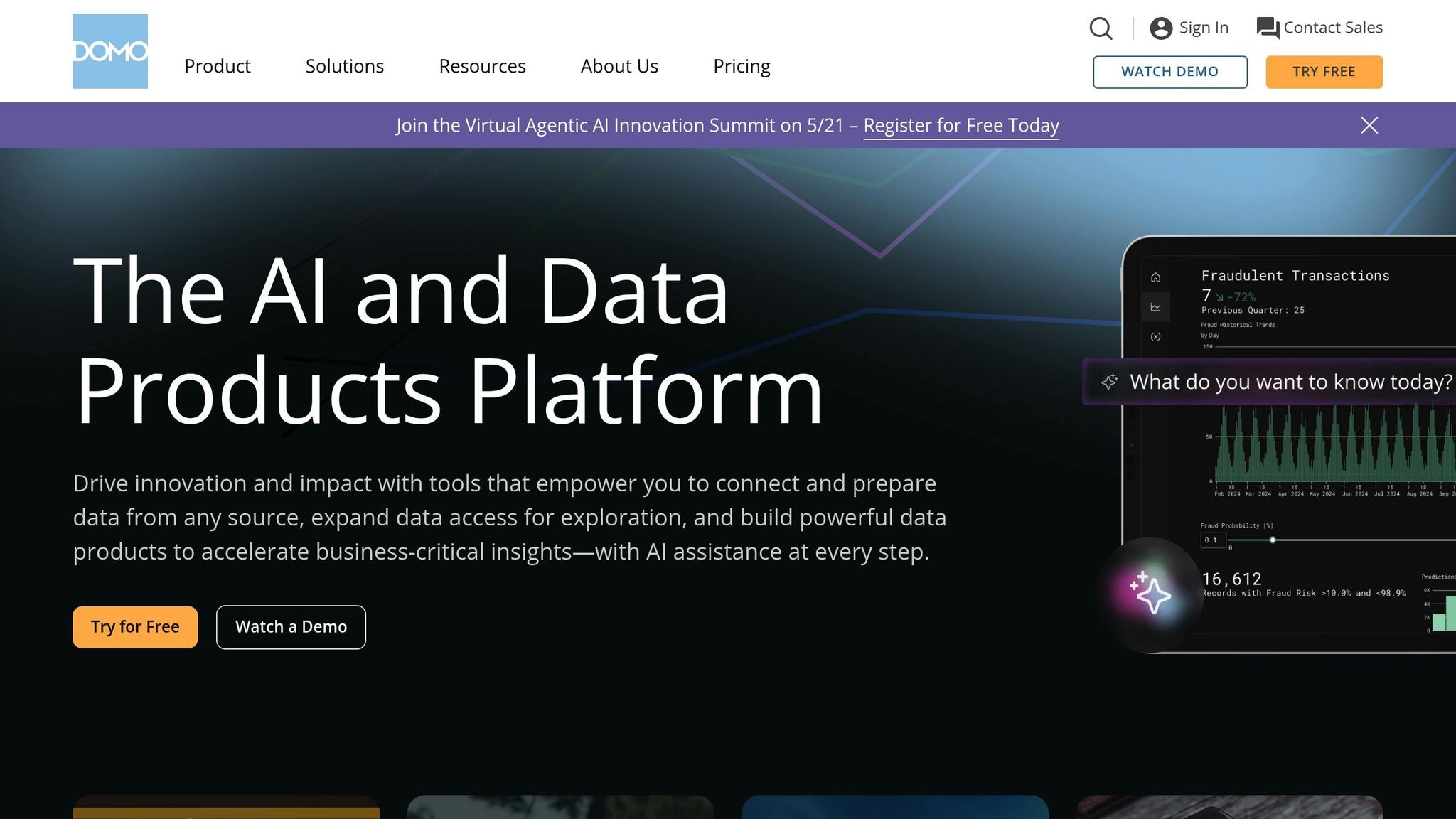
Domo is known for its user-friendly interface and cloud-first approach. With a 4.3 out of 5-star rating on Capterra, it’s a favorite for those seeking simplicity and efficiency.
"It's easy to use. Any tool that requires significant training isn't a tool that is going to be easily adopted. Domo is intuitive and efficient." - Dayna G., Sr Director, Implementation Operations, Automotive
Why Domo?
- Simple, cloud-based design.
- Easy-to-learn interface for quick adoption.
- Ideal for creating dynamic, real-time dashboards.
Choosing the Right Tool
The best tool for you depends on your specific needs, comfort with technology, and the complexity of your data. With pricing ranging from $9.99 to $75 per month, each platform offers unique features to help you showcase your data effectively. Whether you prioritize seamless integration, advanced analytics, or user-friendly design, these tools have you covered.
sbb-itb-89ca1f2
Data Visualization with Portf0lio

Choosing the right visualization tools is just the beginning; seamlessly integrating them into your portfolio is what truly sets your work apart. That’s where Portf0lio comes in, making it easy to showcase your data visualization skills in a professional and polished way.
Adding Visuals to Projects
Portf0lio's project section is designed to help you present your data clearly and effectively. It supports a variety of visualization types, each tailored to specific use cases:
| Visualization Type | Best Use Case |
|---|---|
| Bar Charts | Comparing categories or groups of data |
| Line Charts | Highlighting trends over time |
| Heat Maps | Showing density or intensity patterns |
| Text Tables | Displaying detailed metrics and numbers |
| Interactive Maps | Visualizing geographic data |
As Olivia DiGiacomo, Manager of Product Marketing, puts it:
"Whether you're looking to advance your career in data analytics or just getting started, showcasing your data visualization skills and having samples of your work is essential".
Next, let’s look at how Portf0lio makes setting up your portfolio a breeze.
Quick Portfolio Setup
Creating a professional data visualization portfolio doesn’t have to be time-consuming. With Portf0lio, you can get started in under a minute. The platform offers six beautifully designed templates, specifically crafted for showcasing visual content. Here’s what you’ll get:
- Sections for interactive dashboards to highlight your best work
- Customizable formatting with responsive layouts for any device
- Built-in blog functionality to document your process and insights
Search and Share Options
Getting your portfolio noticed is just as important as building it. Portf0lio includes features to help your work stand out online, tapping into the power of search engine optimization (SEO). Did you know that SEO leads have a close rate of 14.6%, compared to just 1.7% for outbound leads? That’s a huge difference.
Here’s how Portf0lio helps your work get noticed:
- SEO-friendly structure to rank higher in search results
- Real-time analytics dashboard to track engagement
- A single shareable link for easy sharing across platforms
- Custom domain support to personalize your portfolio
- Do-follow backlinks to boost your site’s authority
Considering that 75% of users never scroll past the first page of search results, these tools are vital for ensuring your data visualizations reach the right audience.
Tips for Better Data Visualization
Creating impactful data visualizations isn't just about making them look good - it's about making them clear, useful, and meaningful.
Keep Data Clear and Useful
The foundation of effective data visualization lies in clarity and purpose. As Tom Czaban from GoodData puts it:
"The choices you make with your data visualizations aren't just aesthetic; each decision you make is critical to shaping the message you wish to convey."
When showcasing data in your portfolio, focus on these key practices:
| Best Practice | How to Implement It | Why It Matters |
|---|---|---|
| Remove Excess Elements | Get rid of unnecessary gridlines, labels, and decorations | Keeps the focus on the most important data |
| Use Appropriate Scale | Start axes at zero and maintain proportional relationships | Prevents misleading interpretations |
| Highlight Key Metrics | Use size, color, or bold elements to emphasize key points | Guides attention to the most critical insights |
| Include Context | Add short annotations or explanatory text | Makes the data easier to understand |
By sticking to these principles, you ensure that your data tells a clear and accurate story.
Match Your Visual Style
A consistent visual style not only makes your data easier to understand but also strengthens your brand. Cassandra Quintana, a data visualization expert, explains:
"Effective visualization helps uncover trends, monitor performance, and optimize operations in ways that raw numbers simply can't achieve."
To create a cohesive look, focus on these elements:
Color Strategy
- Stick to 2-3 primary colors that align with your brand or portfolio theme.
- Use color intentionally to highlight important data points.
- Ensure enough contrast to make visuals accessible to all viewers.
- Apply the same color coding across all your charts and graphs.
Typography and Layout
- Choose fonts that are easy to read for both headlines and data labels.
- Keep spacing between elements consistent to avoid clutter.
- Place legends and labels in predictable, easy-to-find locations.
- Standardize chart sizes and proportions for a polished look.
Consistency in these areas helps your audience recognize and trust your work.
Keep Content Current
Outdated data can quickly undermine your credibility. To keep your visualizations relevant:
- Link them to live data sources for real-time updates.
- Schedule regular reviews to ensure accuracy.
- Test any interactive features to confirm they work as intended.
- Validate data connections to avoid errors.
- Document update processes so they’re easy to follow.
- Refresh contextual information as needed to maintain relevance.
Staying on top of updates ensures your visualizations remain both accurate and trustworthy.
Conclusion: Selecting Your Visualization Tool
When it comes to choosing a data visualization tool for your portfolio, it's all about aligning the tool's features with your technical expertise. As Coursera Staff aptly puts it:
"Data visualization brings data to life, making it understandable, memorable, and actionable."
To make an informed decision, focus on these key factors:
| Factor | What to Look For | Why It Matters |
|---|---|---|
| Tech Requirements | Compatibility with data sources, export options, and web integration | Ensures smooth integration with your existing systems |
| Usability | Interface simplicity, learning curve, and support availability | Matches your skill level and minimizes setup time |
| Visual Quality | Customizable visuals, responsive design, and format versatility | Creates polished, professional-looking visualizations |
Beyond these basics, certain integration features can significantly enhance your workflow:
- API compatibility for importing data from various sources
- Support for HTML5 and SVG formats
- Responsive design for seamless viewing on different devices
- Multiple export options, including .PNG, .JPG, .GIF, .PDF, and .HTML
These features ensure your tool remains flexible and efficient, adapting to diverse visualization needs.
Before committing, take advantage of free trials to test whether the tool meets your technical requirements and resonates with your audience. For beginners, platforms with drag-and-drop interfaces, like Domo, provide an easy entry point into data visualization without requiring advanced skills. On the other hand, experienced users might prefer tools like Tableau, which offer deeper customization and the ability to connect with multiple data sources.
Ultimately, select a tool that not only caters to your current needs but also allows room for growth. By choosing wisely, you can create visuals that are both clear and credible - qualities that are essential for building a standout portfolio.
FAQs
What should I look for in a data visualization tool for my portfolio?
When choosing a data visualization tool for your portfolio, prioritize tools that are easy to use, offer professional design options, and integrate seamlessly with your content. The right tool should enable you to showcase your projects, experiences, and achievements in a visually engaging way - without needing advanced technical skills.
Look for features like customizable, clean templates, SEO capabilities to enhance visibility, and the option to share your portfolio through a single, convenient link. These elements can help your portfolio leave a lasting impression while effectively highlighting your skills and accomplishments.
How can I keep my data visualizations accurate and up-to-date?
To ensure your data visualizations stay accurate and meaningful, it's crucial to keep your data up to date. Whenever possible, automate data refreshes. This way, your visuals will always display the latest trends and information without requiring constant manual updates.
Another key step is to validate your data sources regularly. Double-check their accuracy and reliability, look for errors or inconsistencies, and review your data collection methods to ensure they remain effective. These practices are essential for maintaining the trustworthiness and relevance of your visualizations.
How can I make my data visualizations match my brand identity?
To make your data visualizations reflect your brand identity, stick to your brand’s color palette and typography throughout all visual elements. For instance, incorporating your brand colors into charts and graphs ensures a unified and recognizable appearance.
Take it a step further by tailoring the design to match your brand’s personality - this could mean using specific fonts or layouts that align with your visual style. Most importantly, make sure the data is accurate and easy to understand. This not only strengthens your brand’s credibility but also showcases professionalism.